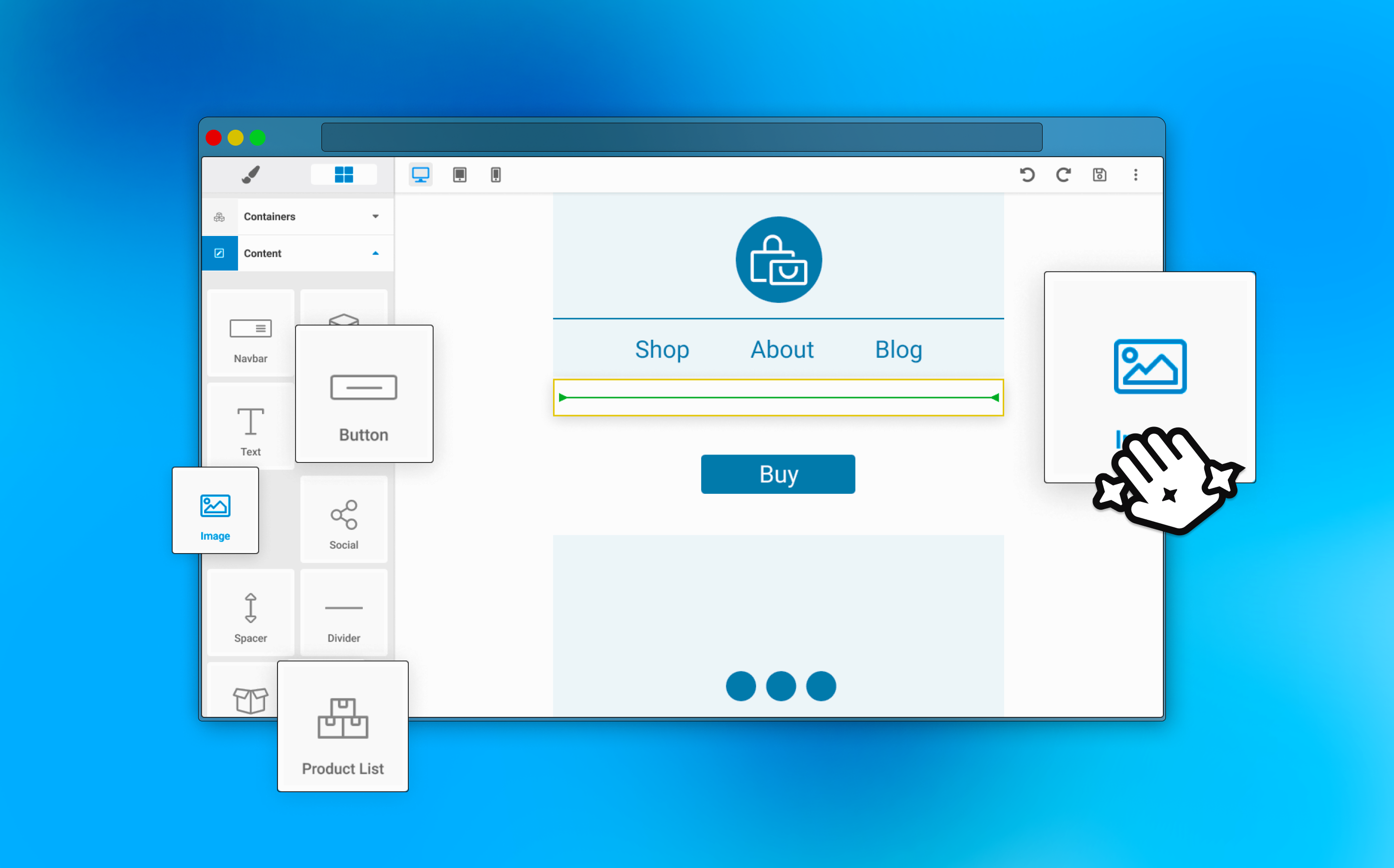
De-complexifying Springbot's Drag & Drop Email Editor
New users spent twice as many clicks in Springbot's email editor and often churned before sending their first campaign. I redesigned the experience to reduce cognitive load, streamline settings, and create a friendlier experience for our tech-anxious users.
My role
As the junior designer, I took ownership of the research and UX strategy for the editor redesign, working closely with engineering and validating direction with the lead designer.
Users Churned Due to Their Builder Experiences
The number one stated reason for churn in Springbot was due to issues the experienced with the software's drag and drop builder experiences. Springbot's email editor in particular was the most complex.
Build on GrapesJS
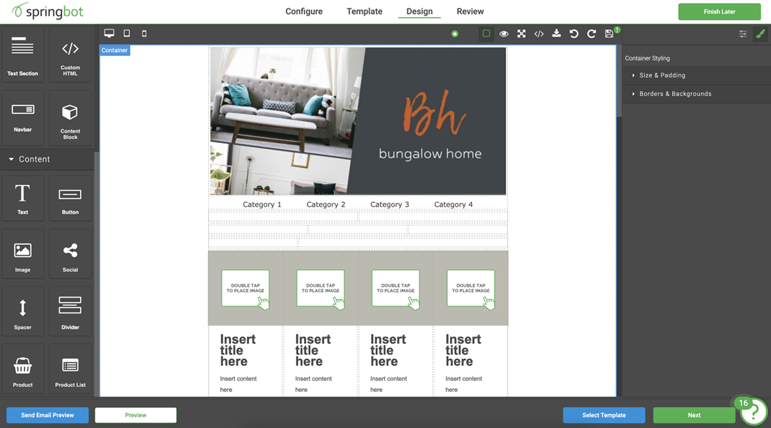
Springbot's email editor was built on top of a framework called GrapesJS. This required the design team to frequently check in with the engineering team. There were often features that could not be removed (or added) without breaking other parts of the editor experience.
Made for Experts, Used by Novices
Our users were often one-person small-business owners learning how to do digital marketing for the first time. Many churned because the email editor was too hard to learn or too time-consuming to use. I watched their FullStory sessions to understand exactly where they struggled. I also met with our internal 'campaign services' team and observed their workflows to contrast expert behavior with first-time users.
Poor hierarchy
Users struggled to orient themselves in the editor. Settings weren't organized in a clear hierarchy, and users frequently had to jump between panels mid-task, which would interrupt their flow.
Made for developers
The editor relied on 'developer-friendly' language (e.g., padding, corner radius) and exposed too many settings. First-time users wasted a lot of time just adjusting settings to see what they did, then couldn't remember in later sessions.
No interaction design
There were few visual cues to offer feedback when users interacted with the builder. Especially around empty states and focus states. This lack of feedback led to frequent user errors.
Users Who Churned Clicked 2x More
In my research, I found that users who churned within their first six months were clicking nearly 2x more in the email builder than users who stayed with Springbot beyond six months. This suggested that satisfied users were able to complete an email with far less effort.

Clicks as a benchmark for simplicity
To decrease churn, we needed to reduce the time and number of clicks required to build an email. Especially for first-time users. This mattered most in the first 30 days, where failure to send an email was highly correlated with churn.
Phase 1: Strip Away What Slows Users Down
I audited the editor's settings and identified underutilized, redundant, and high-effort controls. Many could be replaced with opinionated defaults or lightweight templating. This allowed us to deliver immediate value while we worked toward larger UI improvements.
Phase 2: Offer Patterns Instead of Raw Controls
I designed components that could slot into the existing GrapesJS framework... pre-templated blocks that reduced the need for users to manually adjust every dimension of an email. These incremental improvements let us validate ideas and learn before committing to deeper layout changes.
Phase 3: Rebuild the UI Around User Momentum
Breaking the work into phases gave us room to address foundational issues that would take time and consume more design and developer resources.
Consolidate
Merge scattered settings panels into a single contextual panel.
Usability
Add expected interaction states, increase click targets, and use space more effectively.
Reorganize
Restructure accordions from most-used to least-used settings.
Guidance
Add subtle interactions and focus states to reduce distractions and overwhelm.

User Feedback Helped Us Fine-Tune Simplicity vs. Flexibility
Because the email builder was tightly coupled to GrapesJS, we released updates gradually through a Beta program with our paying customers. This gave us three months to test, validate assumptions, and refine the new editor experience.

A request for more templating
Initial reception was overwhelmingly positive, and a common theme emerged: users wanted more templated options to help them start faster.
Too far in the wrong direction
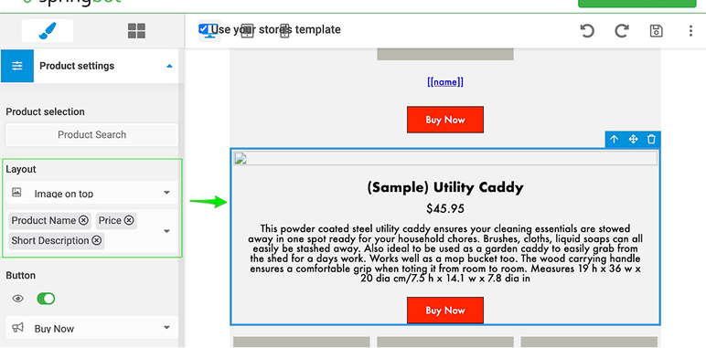
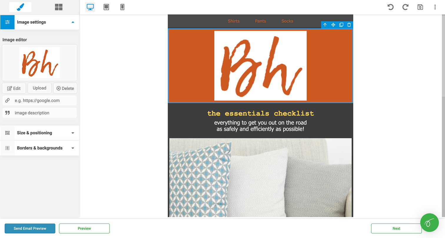
We introduced a templated version of the product module using a multi-select. However, the user's product catalogue didn't always reflect what they wanted in the email.
Adding new settings in
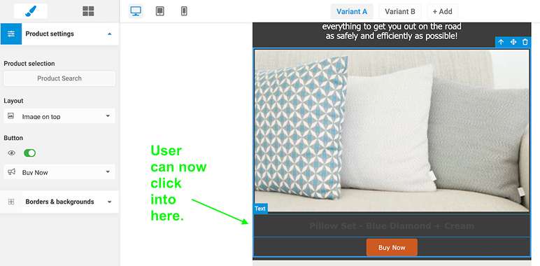
Our solution was to add an editable text field where users could manually add product descriptions, prices, etc. Then they could style and format each according to their needs.
The Smoothest Release in Company History
Typically dev and success managers found releases to be extremely stressful and full of unexpected problems. Leadership noted that the design-led approach made for the smoothest release the company ever delivered in nearly a decade of existence.
Shift in Churn
Customer success noted in the months following that churning users no longer mentioned the email editor as a reason for ending their contracts.
Design Got a Seat at the Table
I learned a lot about how the development process worked in the past at Springbot, and I was able to identify ways that design and engineering could better collaborate together. The successful release helped build the trust needed for me to sit down with team leads and begin developing a shared design language.