Introducing a New Payment Solutions to Mexico's eCommerce Market
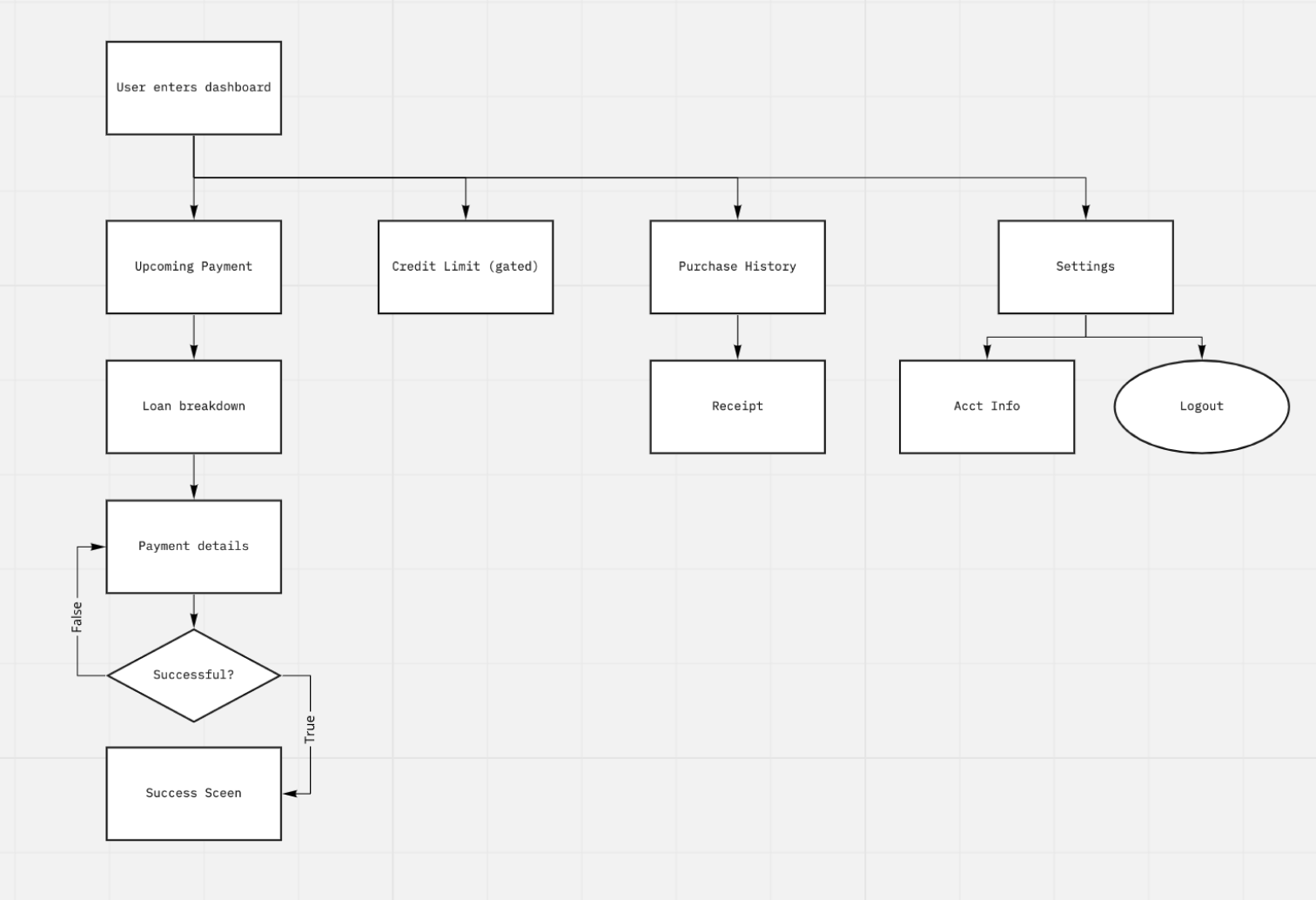
Nelo needed a mobile-first dashboard that would help first-time BNPL users repay loans and understand Nelo's credit system.
Most BNPL users would meet Nelo for the first time after taking out a loan, so the dashboard had to build trust instantly.
My role
As a contract designer, I handled research, flow mapping, and wireframing, and partnered with engineering to ensure feature feasibility. I built a mobile component library and prototype that formed the foundation for Nelo's BNPL repayment experience and design system.
Designing for First-Time Credit Users in an Emerging BNPL Market
Nelo's BNPL experience would be many users' first exposure to installment payments. Nelo needed a repayment dashboard that explained the model clearly, reduced anxiety around fees, and encouraged users to explore the full Nelo app.
Unfamiliar with installments
Only 9% of Mexican residents have a credit card. For the 91% of Mexican residents who do not have a credit card, Nelo would be their first opportunity to pay in installments.
Mobile only
It was predicted users would access the dashboard through a mobile device only.
What Competitors Told Me About Trust
Because BNPL was still new in Mexico, I extended Nelo's initial research with a competitor analysis. I mapped the flows of three BNPL products and synthesized user reviews to understand what created trust—and what broke it.
Accessibility by mobile mattered
Users valued dashboards that were easy to access and manage entirely from mobile.
Clarity reduced anxiety about BNPL
People responded well when platforms clearly explained how installments worked and what to expect.
When fees felt hidden, it broke trust
When users felt "tricked" into late fees or unclear repayment rules, satisfaction dropped sharply.
Users wanted to know credit limits
When BNPL services didn't show a credit limit upfront, rejected purchases felt arbitrary.
Linking Two Financial Models Into One Experience
Improving repayment compliance and increasing app downloads was the main stakeholder goal.
I needed to bridge two different mental models: Nelo's existing credit system and the new BNPL product.
Mapping UX to existing credit structure
I mapped the current credit user flow and layered BNPL features on top to ensure both products mirrored each other. This allowed the dashboard to support repayment, transparency, and upsell moments without introducing unnecessary cognitive load.
Progress Indicators Must Be Obvious
I began by building a responsive component library in Figma so the UI could scale quickly with new features or feedback. Using these components, I built a mobile-first dashboard and moved directly into user testing before creating desktop variations.
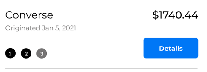
Problem: dots looked like breadcrumb menu
Users found the dashboard clear overall, except for one element:
"What are the dots? Why can't I click these?"
The dots were intended to show repayment progress, but users assumed they were a navigational pattern.
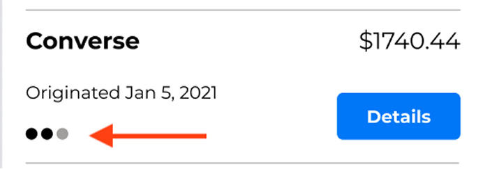
Solution: add numbers, increase size
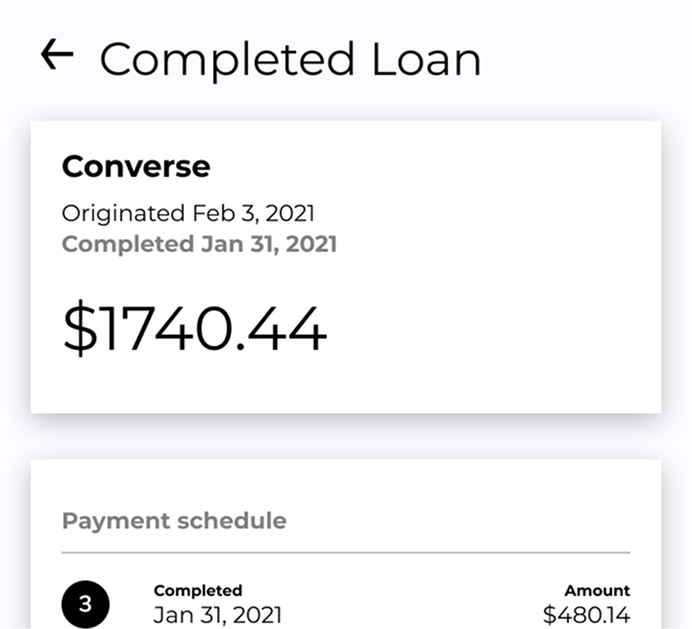
By enlarging the markers and adding step numbers inside each circle, users immediately understood them as progress indicators.
Follow-up testing confirmed the confusion was resolved. Stakeholders were especially happy with how this component turned out.
Problem: detail view didn't communicate progress
During a review with stakeholders, we identified another gap: the loan detail view didn't clearly explain how fees, early payments, or changes in totals affected the remaining balance.
This often created support tickets, and they hoped an improvement here would reduce support tickets.
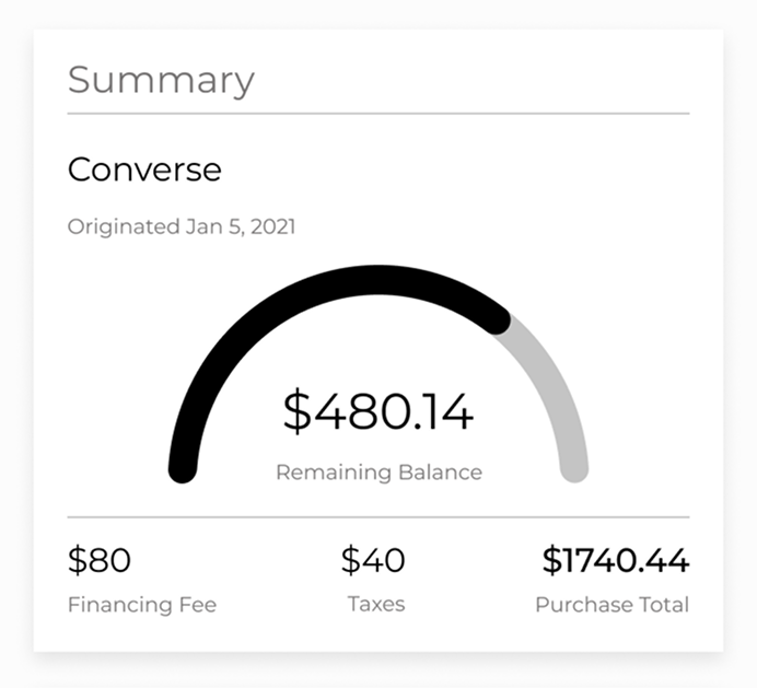
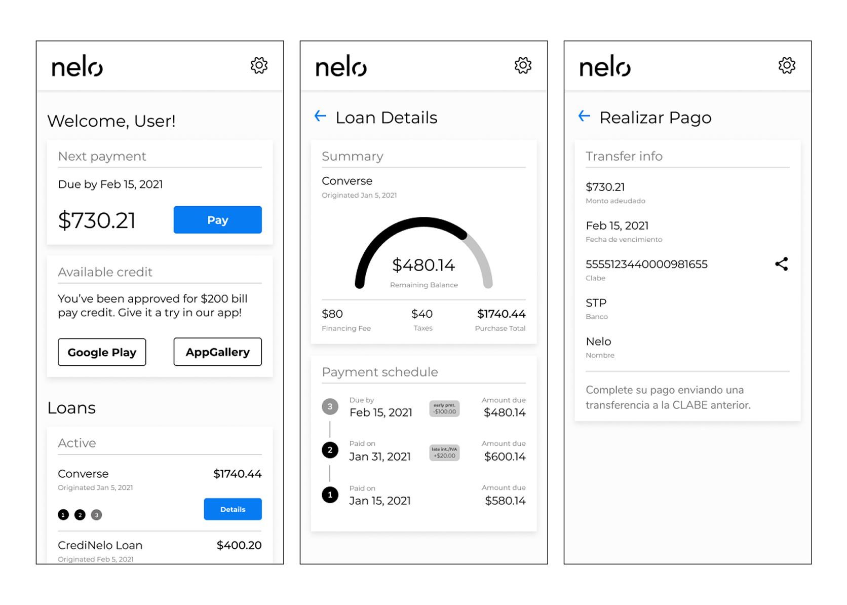
Solution: add progress chart, show breakdown
I introduced a visual chart that showed:
- Total remaining balance
- Progress toward completion
- Breakdown of fees, taxes, and purchase amount
This provided clear context for what the user owed.
What This Project Taught Me About Designing Solo
Working independently pushed me to rely on process. Creating a lightweight component library and syncing frequently with engineering made rapid iteration possible.
I also learned the value of involving people outside R&D early. Some refinements surfaced late in the project that could have been resolved sooner with broader collaboration.